Build to Convert: 7 Essential Website Design Elements You Can’t Ignore
In today’s fast-paced digital world, a website isn’t just a place for people to learn about your business—it’s a powerful tool to drive conversions. Whether you want to increase sign-ups, boost sales, or generate leads, the design of your website plays a pivotal role in achieving those goals. Did you know that 94% of first impressions are design-related? That means your website’s look and feel can make or break your conversion rates.
In this blog, we will explore the 7 essential elements of website design that can help you build a site optimized for conversions. These elements not only enhance user experience but also drive action, turning casual visitors into loyal customers. Let’s dive in!
Why High-Converting Website Design Matters
Website design directly influences user behavior and engagement. A well-designed website can captivate users, foster trust, and create a seamless experience, ultimately guiding them toward completing your desired actions, such as signing up for a newsletter, purchasing a product, or booking a service.
On the other hand, poor website design can result in high bounce rates, low engagement, and missed opportunities. A website that’s hard to navigate, slow to load, or lacks credibility signals can quickly turn users away. Consider these statistics:
- 40% of people will abandon a website that takes more than 3 seconds to load.
- 38% of visitors will stop engaging with a website if the content or layout is unattractive.
With these facts in mind, it’s clear that a website’s design is more than just aesthetics—it directly impacts your conversions and, ultimately, your bottom line.
The 7 Essential Elements of High-Converting Websites
1. Clear CTAs (Call-to-Action)
One of the most critical elements of a high-converting website is a clear and compelling Call-to-Action (CTA). Without a CTA, users may not know what step to take next, which can lead to missed conversions. A CTA should be action-oriented, using verbs like “Buy Now,” “Sign Up Today,” or “Get Started.” Here are some design best practices for CTAs:
- Prominent Placement: Position your CTAs in highly visible spots, preferably above the fold (the portion of the webpage visible without scrolling).
- Use Contrasting Colors: Ensure your CTAs stand out visually from the rest of the page. A button in a contrasting color can draw users’ attention immediately.
- Concise Text: Keep your CTA copy short, clear, and action-driven to avoid confusion.
- Test Variations: A/B testing different CTA text, designs, and placements can help you identify what works best for your audience.
2. Fast Loading Speed
Website speed is a major factor in user experience and conversions. Users expect a website to load within 3 seconds; otherwise, they are likely to bounce. In fact, a delay of just 1 second in page load time can reduce conversions by 7%.
Optimizing your website’s speed is crucial to retaining visitors and improving conversions. Here are a few tips:
- Compress Images: Large images can slow down a website. Use tools like TinyPNG or ImageOptim to reduce image sizes without compromising quality.
- Enable Caching: Caching allows your site to store certain elements in the browser’s cache, speeding up load times for returning users.
- Minimize HTTP Requests: Reduce the number of elements on each page (like scripts, images, and CSS files) to reduce the time it takes for the page to load.
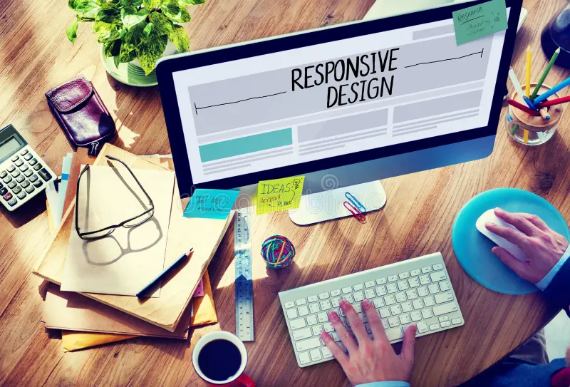
3. Mobile Responsiveness
With over half of all website traffic coming from mobile devices, mobile responsiveness is no longer optional. A website that isn’t mobile-friendly can cause frustration, increase bounce rates, and hurt conversions.
To ensure your website is mobile-responsive, consider the following:
- Test Across Devices: Regularly test your site on different devices to ensure it displays correctly on various screen sizes.
- Use a Responsive Framework: Frameworks like Bootstrap or Foundation make it easier to design websites that automatically adjust to different screen sizes.
- Simplify Navigation: On mobile, space is limited. Consider using a hamburger menu or sticky navigation to save space and improve the user experience.
4. Simple Navigation
A website’s navigation should be intuitive and easy to use. If users cannot find what they’re looking for within a few clicks, they are likely to leave and go to a competitor’s site. To enhance your website’s navigation:
- Limit Menu Items: Keep your navigation menu simple, with only the most essential categories. This reduces clutter and makes it easier for users to find what they need.
- Use Clear Labels: Avoid jargon or vague terms. Use clear labels like “Services,” “About Us,” and “Contact.”
- Add Breadcrumbs: Breadcrumbs are useful for improving navigation and helping users track their location on the site.
5. Trust Signals
Trust is a huge factor in conversions. Trust signals, like customer reviews, testimonials, certifications, and security badges, help reassure visitors that your business is reliable and trustworthy.
Here are some ways to implement trust signals on your website:
- Customer Testimonials: Showcase positive feedback from customers to provide social proof and build credibility.
- Security Badges: Display badges like SSL encryption or trusted payment processors (e.g., PayPal, Visa) to show your site is secure.
- Certifications or Accreditations: If you’re a certified expert or have received industry accolades, display those on your site to enhance trust.
6. Engaging Visual Design
Visual elements play a significant role in keeping users engaged and guiding them through your website. Your website’s design should be clean, professional, and consistent with your brand identity. This includes your color scheme, typography, and imagery.
To create an engaging visual design:
- Use High-Quality Images: Choose images that are visually appealing, relevant to your content, and of high quality. Avoid using generic stock photos.
- Keep It Consistent: Stick to a consistent color palette, font style, and layout across all pages to reinforce your brand identity.
- Whitespace: Proper use of whitespace helps avoid a cluttered look, making it easier for users to navigate and absorb information.
7. SEO-Optimized Content
Even the best-designed website won’t convert if it’s not found. SEO-optimized content ensures your website ranks well on search engines, driving more organic traffic. But SEO isn’t just about keywords; it’s also about providing value to your visitors.
Here’s how to optimize your content for both users and search engines:
- Use Relevant Keywords: Include keywords that your audience is searching for, but avoid keyword stuffing.
- Optimize Meta Tags: Write compelling meta descriptions and title tags that are optimized for SEO.
- Optimize for Readability: Use short paragraphs, headings, and bullet points to make your content easy to read and digest.
- Add Alt Text to Images: Help search engines understand what’s in your images by adding descriptive alt text.
Common Mistakes to Avoid
- Overloading Pages with Content or Visuals
Too much information or too many visuals can overwhelm users. Keep it simple, with a focus on key messages. - Ignoring Mobile Responsiveness
A website that isn’t optimized for mobile will lose traffic. Always test on mobile. - Weak CTAs
If your CTAs aren’t clear or prominent, users won’t take action. Ensure they’re compelling and easy to find. - Lack of Trust Signals
Not including trust signals can make visitors hesitant. Always show proof that your site is secure and credible. - Slow Page Load Times
A slow website can lead to high bounce rates. Ensure your pages load quickly to keep visitors engaged. - Cluttered or Confusing Navigation
If users can’t easily find what they’re looking for, they’ll leave. Keep navigation intuitive and streamlined. - Overuse of Pop-Ups
Too many pop-ups can annoy users and lead to a poor experience. Use them sparingly and make sure they’re relevant to the visitor’s journey.
Tips for Testing and Improving Your Website Design
1. A/B Testing for Critical Elements
A/B testing (also known as split testing) involves comparing two versions of a webpage to determine which one performs better. Regularly A/B test various elements of your website, including:
- CTA Buttons: Test different wording, colors, and placements to see which version drives the most clicks.
- Headlines: Experiment with various headline formats to see which one resonates best with your audience.
- Images: Test variations of product images, banners, or hero images to identify which one leads to higher engagement.
2. Use Heatmaps and User Session Recordings
Heatmaps track where visitors click, scroll, or hover the most on your pages, providing valuable insights into user behavior. Tools like Hotjar, Crazy Egg, or Lucky Orange can help you gather this data. By analyzing heatmaps and user session recordings, you can identify:
- Click patterns: Determine if visitors are clicking on non-interactive elements or overlooking important links.
- Scroll depth: See how far users scroll down on key pages and adjust content placement accordingly.
- Engagement areas: Recognize which sections of your site users find most engaging and focus on optimizing those areas further.
3. Monitor Bounce Rates and Adjust Accordingly
A high bounce rate often indicates that users aren’t finding what they’re looking for or that the website’s design isn’t engaging enough. Use Google Analytics to monitor bounce rates across different pages. If a particular page has a high bounce rate, consider these adjustments:
- Improve Page Load Speed: Slow-loading pages often lead to higher bounce rates. Optimize images, reduce redirects, and minimize unnecessary scripts.
- Enhance Content: Ensure your content is aligned with user intent. Use clear headings, concise copy, and compelling visuals to keep visitors engaged.
- Refine Navigation: Make sure users can easily find what they’re looking for with minimal clicks. Consider improving internal linking and menu organization.
4. Implement User Feedback
Gather direct feedback from your users to identify design areas that need improvement. Consider the following methods:
- Surveys: Embed short surveys or pop-ups asking visitors about their experience (e.g., “Was this page helpful?” or “What are you looking for today?”).
- Live Chat: Offer live chat on key pages to assist users and capture insights about their pain points or questions.
- Usability Testing: Conduct usability testing with real users to identify friction points in the user journey. Ask participants to perform specific tasks on your website while observing their behavior.
5. Mobile-First Testing
With the increasing volume of mobile traffic, mobile-first testing should be a priority. Make sure your website design not only responds to different screen sizes but also offers a smooth, intuitive experience on mobile. Consider the following:
- Test on Real Devices: While desktop simulations are helpful, it’s essential to test on actual mobile devices to assess how elements render and behave.
- Tap Target Size: Ensure buttons, forms, and links are large enough for easy tapping without accidental clicks.
- Vertical Scrolling: On mobile, users are more accustomed to scrolling vertically. Design for easy flow from top to bottom rather than side navigation.
6. Track Conversion Funnel Behavior
A conversion funnel tracks the path a user takes from landing on your site to completing a desired action, such as making a purchase or signing up. Analyzing the conversion funnel helps pinpoint where users drop off. Use tools like Google Analytics and Conversion Rate Optimization (CRO) tools to track funnel steps:
- Identify Drop-off Points: If users are abandoning your form or cart, consider reducing friction (e.g., eliminating unnecessary fields or offering payment options).
- Segment Funnel Stages: Break down the funnel into stages (e.g., landing page > product page > checkout). Use this data to understand which stages need improvement.
Website design isn’t just about making your site look good—it’s about creating a seamless user experience that drives conversions. By focusing on the seven essential elements outlined in this blog—clear CTAs, fast loading speed, mobile responsiveness, simple navigation, trust signals, engaging visuals, and SEO-optimized content—you can build a website that not only attracts visitors but also converts them into loyal customers.
FAQs
What is a high-converting website design?
A high-converting website design focuses on optimizing user experience, clear CTAs, fast load times, and trust signals to encourage users to take action, such as signing up or making a purchase.
How can I test my website’s design?
You can test your website’s design through A/B testing, heatmaps, and user behavior analysis tools like Hotjar.
What are trust signals, and why are they important?
Trust signals, like customer reviews, security badges, and certifications, help build credibility and trust with visitors, encouraging them to convert.
How does mobile responsiveness affect conversions?
Since more than half of web traffic comes from mobile, a non-responsive site can lead to a poor user experience and increased bounce rates, hurting conversions.
Why is website speed important for conversions?
Faster websites improve user experience and reduce bounce rates. Slow websites often lose visitors before they even see your content, which negatively impacts conversions.
How can SEO help with website conversions?
SEO ensures your site ranks higher on search engines, driving more targeted traffic. Optimized content also enhances user experience, leading to better conversion rates.
Ready to Master Digital Marketing? Sign Up Today!
Inspiring Job Placement Success Stories

Our Achievers Ready to Lead the Industry