The Art of Color: Creating Web Graphics that Capture Attention
weWhen it comes to web design, visuals play a significant role in capturing attention, conveying messages, and guiding users through your site. While layout, typography, and content are important, color is one of the most powerful tools a designer has. It shapes first impressions, influences emotions, and even drives user behavior.
The colors you choose for your website can mean the difference between users staying engaged or bouncing away. For example, red can provoke urgency, blue can inspire trust, and yellow can stimulate creativity. A strong understanding of color theory is essential for creating web graphics that not only look appealing but also perform effectively in engaging and converting users.
In this blog, we will explore the art of color theory and how you can harness its power to create impactful web graphics that resonate with your audience, strengthen your brand, and enhance user experience.
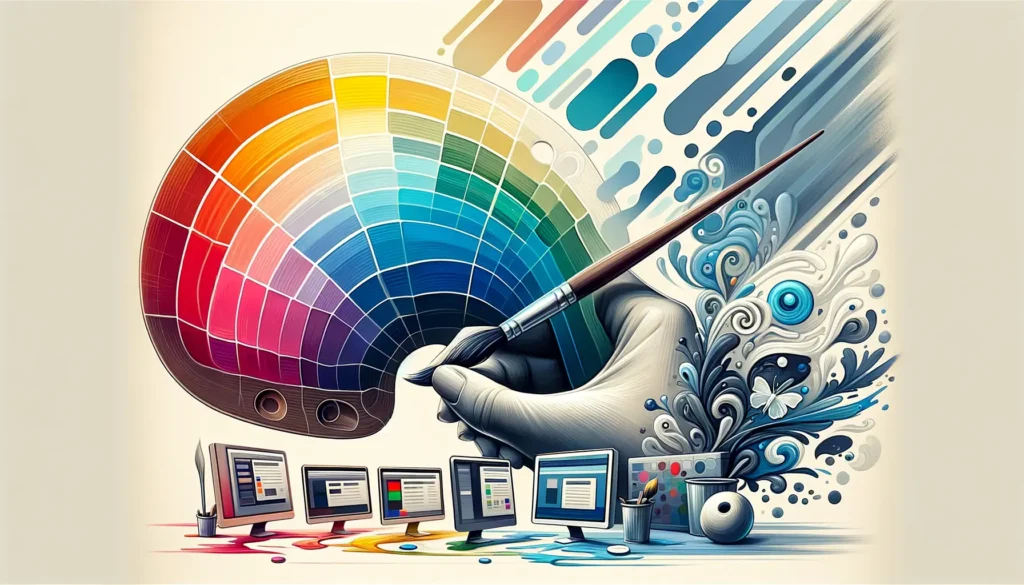
What is Color Theory?
Color theory is a framework used by designers and artists to create color combinations that are aesthetically pleasing and convey specific moods or messages. It is based on the color wheel, a tool that organizes primary, secondary, and tertiary colors in a circular format, helping designers see how different colors relate to one another.
There are three main components to color theory:
- Primary Colors: Red, blue, and yellow. These colors are the foundation of all other colors and cannot be created by mixing other colors.
- Secondary Colors: Green, orange, and purple. These are created by mixing two primary colors.
- Tertiary Colors: These are the result of mixing a primary color with a secondary color, such as red-orange or yellow-green.
Understanding how these colors interact with each other is crucial when designing web graphics. By utilizing complementary, analogous, and triadic color schemes, you can create designs that are both visually appealing and functional.
Psychology of Color
The psychology of color examines how different colors can evoke specific emotional responses from viewers. In web design, understanding color psychology can help influence user behavior and shape how your website is perceived. Here’s a quick overview of how different colors are often interpreted:
- Red: Known for its energy and excitement, red can create a sense of urgency and draw attention. It’s often used in call-to-action buttons (like “Buy Now” or “Shop”).
- Blue: Associated with trust, professionalism, and calm, blue is often used by financial institutions, healthcare websites, and tech companies.
- Yellow: A bright and optimistic color, yellow is often used to inspire creativity and happiness. However, it should be used sparingly, as too much yellow can be overwhelming.
- Green: Symbolizing growth, health, and tranquility, green is commonly used by eco-friendly brands and health-related businesses.
- Purple: Often associated with luxury, creativity, and wisdom, purple is a favorite for high-end brands, beauty products, and artistic websites.
- Black: Black is elegant, sophisticated, and timeless. It’s frequently used by luxury brands and in minimalist designs.
- Orange: Energetic and playful, orange can encourage excitement and action. It’s frequently used in e-commerce and entertainment websites.
- White: A symbol of cleanliness, simplicity, and space, white can make designs appear more open and minimalist.
Color choice should always be aligned with the message or emotion you want to convey to your audience. It’s essential to consider not just the aesthetics but also the cultural connotations and audience perception of each color.
Color Harmony for Visual Appeal
One of the key principles in color theory is the concept of color harmony, which refers to the arrangement of colors that are visually pleasing when combined. There are several color schemes to create harmony, each evoking a unique feel for your web graphics. Here are some of the most commonly used color harmonies:
- Complementary Colors:
- These are colors that sit opposite each other on the color wheel, like blue and orange or red and green. Complementary colors create high contrast and can make certain elements pop. However, too much contrast can be jarring, so use it strategically.
- Analogous Colors:
- These colors sit next to each other on the color wheel. They create a sense of harmony and are usually used to create a calm, cohesive feel. For example, a palette of blue, blue-green, and green works well for websites that want to convey calmness and trust.
- Triadic Colors:
- This color scheme uses three evenly spaced colors on the color wheel. For example, using primary colors (red, blue, and yellow) or secondary colors (green, orange, and purple) together. Triadic schemes offer balanced, vibrant designs and are often used to create lively, dynamic web graphics.
- Split-Complementary Colors:
- A variation of the complementary scheme, split-complementary uses one base color and two adjacent colors to the complementary color. This provides contrast like the complementary scheme but with more variety and less tension.
When choosing color harmonies, consider the mood, purpose, and branding of your site. The right color combination will create a visual flow that makes the content easy to navigate and the design more engaging.
Contrast & Accessibility
While harmony is essential, contrast is equally important, especially when it comes to web accessibility. Good contrast improves the readability of your website, ensuring that text stands out against the background and is easily legible. It’s crucial for guiding the user’s eye toward key elements, such as calls-to-action, headlines, or buttons.
For instance, a dark text on a light background, or vice versa, is easier to read than low-contrast combinations, like dark gray text on a black background.
Accessibility Considerations:
- Not all users perceive color the same way. Color blindness affects approximately 8% of men and 0.5% of women worldwide, which means web designs must be color-blind friendly.
- Tools like the Web Content Accessibility Guidelines (WCAG) recommend a minimum contrast ratio for text and background colors to ensure content is readable for everyone, regardless of their ability to perceive certain colors.
- Avoid relying on color alone to convey information (e.g., using only red to indicate an error). Combine color with text or symbols for clarity.
Branding with Color
Your brand’s colors tell a story. They communicate your company’s values, establish a connection with your target audience, and differentiate you from competitors. When selecting colors for your website, think about the emotions you want to evoke and the message you want to send.
- Brand Identity: The colors you choose should align with your brand’s personality. For example, a luxury brand might use deep purple and gold, while a tech company might opt for blue and white for a clean, modern feel.
- Consistency Across Platforms: Ensure your color palette remains consistent across all digital platforms, from your website to social media and email marketing. This consistency builds recognition and trust with your audience.
Before finalizing your color palette, consider creating mood boards and testing your choices with focus groups or through A/B testing to ensure they resonate with your target demographic.
Conclusion
Color is not just an aesthetic choice—it’s a powerful tool that influences emotions, user behavior, and conversions. By mastering color theory, you can create web graphics that grab attention, enhance user experience, and strengthen your brand’s identity.
Whether you’re working on a website redesign or creating graphics for marketing campaigns, understanding the psychology of color, the importance of contrast, and the principles of color harmony will help you create visuals that not only look good but also perform well.
By using color thoughtfully, you’ll ensure that your web graphics stand out, engage users, and leave a lasting impact. So go ahead—harness the power of color and elevate your web design to new heights!
FAQs
What is the best color scheme for a website?
The best color scheme depends on your brand, audience, and goals. However, complementary, analogous, and triadic schemes are popular choices for creating visually balanced designs.
How do I choose colors for my website
Choose colors that align with your brand’s message, purpose, and the emotions you want to evoke. Consider color psychology, color harmony, and contrast to ensure a visually pleasing and functional design.
What is the most accessible color combination for websites?
High-contrast color combinations, such as dark text on a light background, improve accessibility. Ensure your design meets WCAG guidelines for color contrast and consider using other indicators besides color (e.g., icons or text).
How can color affect user behavior on my website?
Color can influence how users interact with your website. For example, red can create urgency, blue can inspire trust, and green can encourage relaxation. Using color strategically can guide users through your site and improve conversion rates.
Should I consider color-blind users when designing my website?
Yes! It’s essential to consider color-blind accessibility when designing. Avoid relying solely on color to convey information, and use tools to check contrast ratios for readability by all users.
How do I test my website’s color palette?
A/B testing, user feedback, and focus groups are great ways to evaluate your color choices. Tools like Adobe Color and Colors can help you experiment with different palettes before making final decisions.
Ready to Master Digital Marketing? Sign Up Today!
Inspiring Job Placement Success Stories

Our Achievers Ready to Lead the Industry